A BITE FOR FRONT DEVELOPERS:
"Best React UI component libraries and frameworks in NOV-22"
Here’s the final lineup selected after hours of careful consideration:
- Material Kit React
- VechaiUI
- Ant Design for React
- Storybook
- React Admin
- Shards React
- MUI
- React Bootstrap
- React Virtualized
- Argon Design System React
- Blueprint
- Semantic UI React
- React Toolbox
- React Desktop
- Onsen UI
- Evergreen
- Reactstrap
- Rebass
- Grommet
- Elemental UI
- React Suite
- Belle
- react-md
- PrimeReact
- KendoReact
- Arco Design
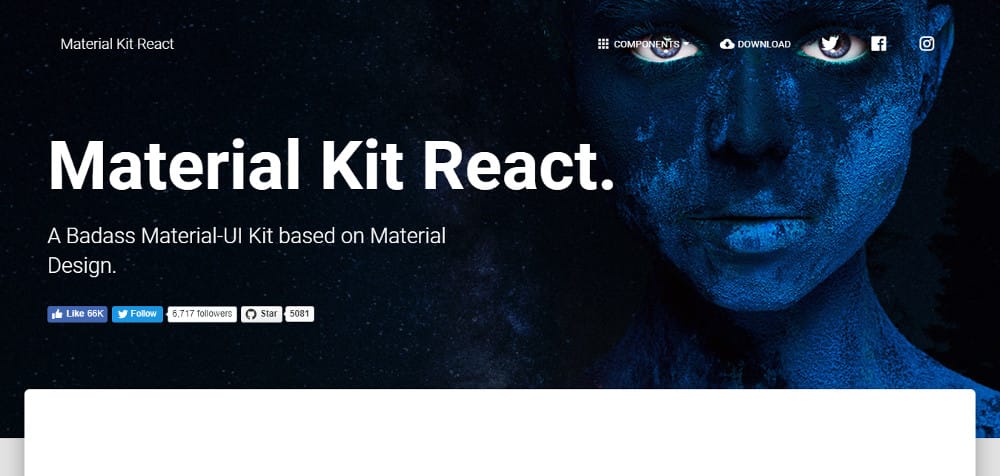
Created with inspiration from Google’s Material Design, Material Kit React builds a set of elements that put consistency as the main feature. That way, your web development project retains a similarity in appearance and functions all through.
The general layout resembles multiple sheets of paper. This imparts a depth and order to the layouts. Three example pages are included. Not only will these pages illustrate what’s possible with this kit, they also serve as templates where you can substitute text and images with your own.
The kit also contains a number of basic elements such as buttons, badges, sliders, menu, pagination, navigation bars, tabs and pills. Using this React component library, you’ll be able to customize the style, size and color for most elements. The JavaScript elements include Modals, tooltips, date-time picker, carousels and popovers. Besides using the kit to start a new project, you can also restyle any old Bootstrap project. The Material Kit React Pro version contains a lot more components, sections and example pages.
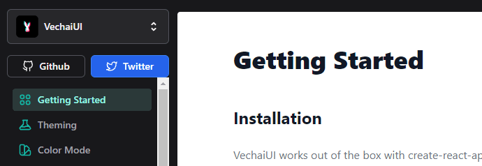
VechaiUI is a relatively new React component library that features theming and dynamic colors for your components and works out-of-the-box with create-react-app. The library itself includes components for forms, data display, navigation, media, icons, notifications, and lots more.
The components are accessible and built using TypeScript and Tailwind CSS (a nice bonus for existing Tailwind developers). The project continues to gain popularity on GitHub and is worth keeping an eye on as it grows and improves.
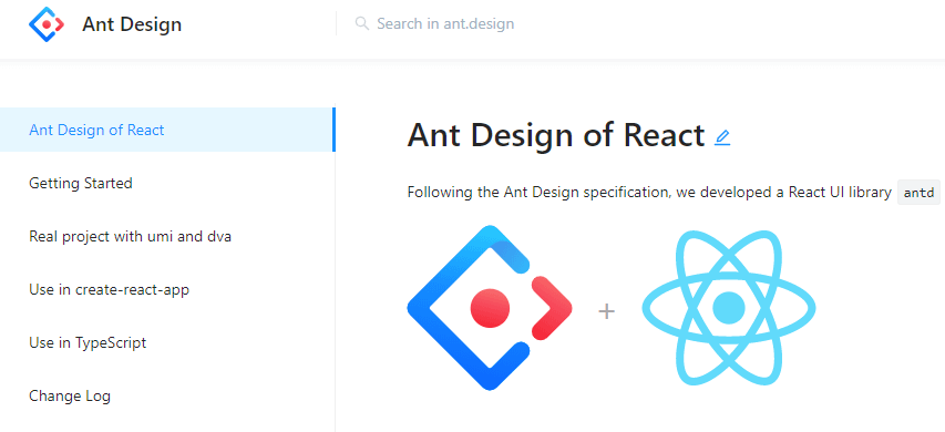
This React UI library is a design system for enterprise-level products. It’s based on the Ant Design project and contains a set of high quality components and demos for building rich, interactive UIs. The components include internationalization support for dozens of languages.
You also have the ability to customize the components to your own design specifications. Ant Design uses Less.js for its style language. The Ant Design components include buttons, icons, grids, breadcrumb, dropdown menus, pagination, and more.
The Ant Design project has thousands of stars on GitHub, so it’s hugely popular with developers.
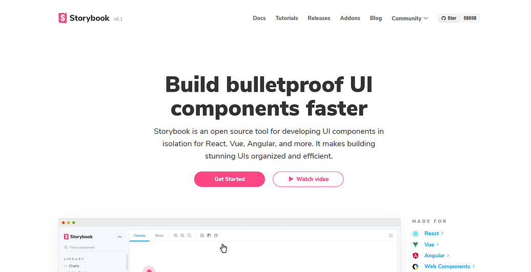
Storybook has been popular for some time now. It isn’t exactly a component library itself but is an open source tool for developing UI components in isolation for React and many other technologies and platforms. What sets Storybook apart is that it allows you to work on a single component at a time, which makes development so much faster.
The GitHub repo for Storybook boasts thousands of stars and you can always check the latest major release and any incremental updates on the Storybook release page.
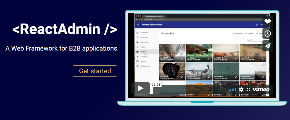
This React UI component framework is suitable for building business-to-business (B2B) admin applications on top of REST/GraphQL APIs and is customizable by design. It’s built with a number of well known projects in addition to React: Material UI, React Router, Redux, and React Final Form. The latter is a popular form state management solution.
In addition to the free version and its components, there’s also an enterprise solution. The enterprise solution includes pro support from Marmelab (the creators) and access to private modules.
React Admin boasts has thousands of stars on GitHub, and is actively maintained.
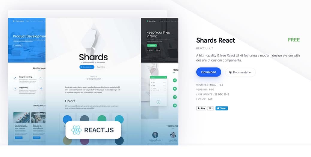
Shards React is an open source, modern React UI kit that’s built from scratch and geared towards fast performance. The modern design system allows you to change many things. What’s more, you can download the source files to change things at code level too. The SCSS used for styling only enhances developer experience.
This component library is based on Shards, and uses React Datepicker, React Popper (a positioning engine) and noUIShlider. It supports Material and Fontawesome icons. The Shards Pro package has 15 pre-made pages that help you get started. Helpfully, these pages use blocks that you can move around.
It has a modest amount of stars on GitHub and includes dozens of custom React components such as range sliders and toggle inputs. The 350+ components ensure that you can build almost every type of website with Shards React.
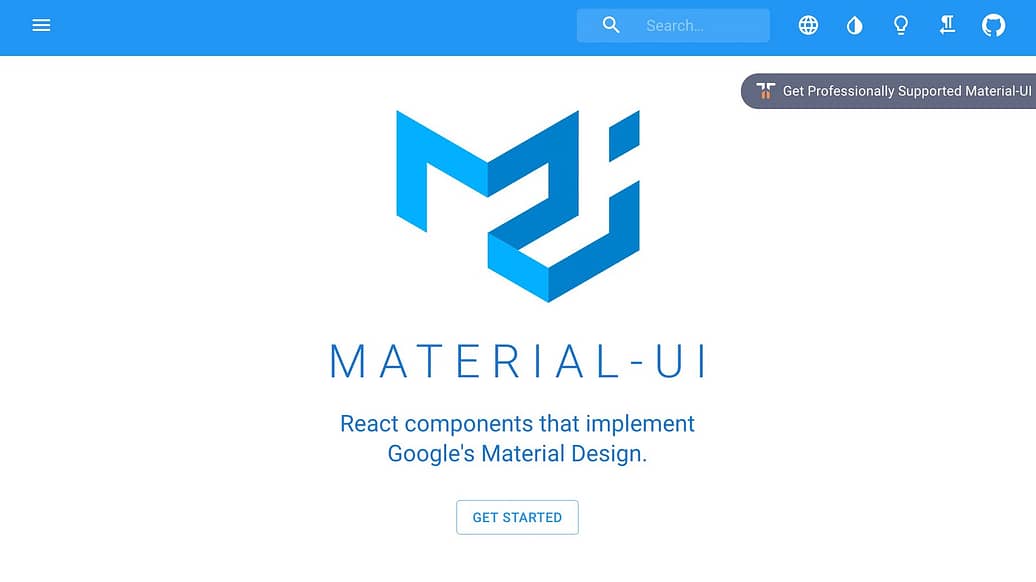
Formerly branded as Material-UI, MUI has thousands of stars on GitHub, ranking among the most popular React UI component libraries. The components rely on React, but use Google’s Material Design. For those of you who need filling in, Material Design takes inspiration from the physical world and textures while keeping the actual UI elements to a minimum.
A wide range of helpful components are available, like app bars, auto complete, badges, buttons, cards, dialog boxes, icons, menus, sliders and more. Helpfully, MUI also offers React themes and templates, so you can have a custom color theme for your app.
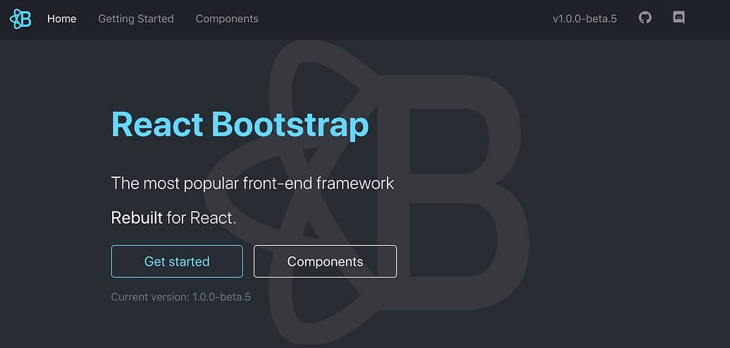
Next on our list of React UI component libraries is React Bootstrap. This UI kit retains its Bootstrap core but replaces Bootstrap’s JavaScript with React, in order to give you more control over the form and function of each component. Each component is accessible, important for front-end framework building.
And since React Bootstrap doesn’t deviate much from its Bootstrap origins, developers can choose from the thousands of Bootstrap themes readily available. It’s earned thousands of stars on GitHub.
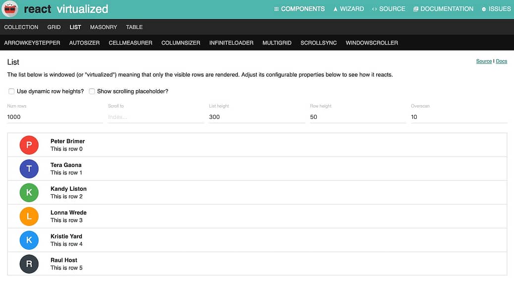
Building a frontend that’s data heavy? React Virtualized may be the library you need to dip into. It includes numerous components for efficiently rendering large lists, tables and grids. For example, you’ll find masonry, columns, autosizers, direction sorters, window scrollers and more. Further, you can customize the tables by configuring the row heights and display placeholders in the cells.
React Virtualized has very few dependencies and supports standard browsers, including recent mobile browsers for iOS and Android. It has thousands of stars on GitHub.
Argon Design System React
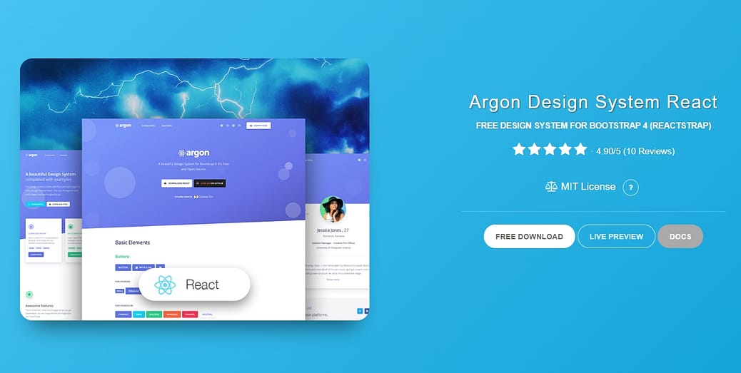
This library offers a free design system for Bootstrap 4, React, and Reactstrap. It comes with 100 modern and gorgeous elements that are implemented in fully-functional code, so you can switch from a page to the actual website effortlessly.
The Argon Design System offers pre-built example pages and a handful of variations for all the components such as colors, styles, hover, and focus.
Take a sneak peek at the entire set of components, featuring basic elements, typography, navbars, alerts, images, icons, Javascript components, and more.
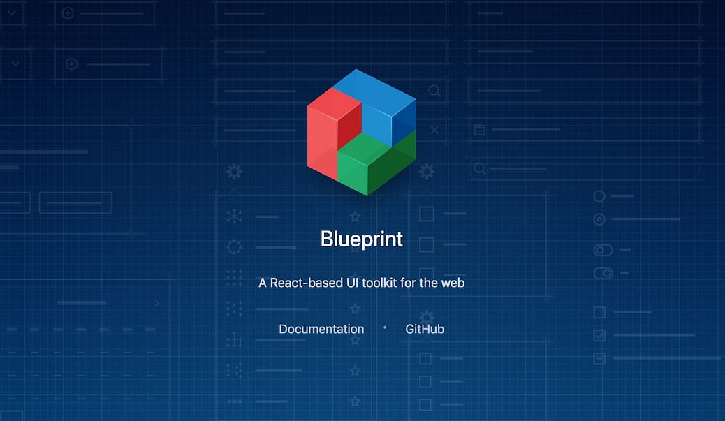
The React components in Blueprint are primarily for use on desktop applications. These components are particularly suitable for building complex and data-dense interfaces. From the component library, you can pick up bits of code for generating and displaying icons, for interacting with dates and times, for picking timezones, and more.
What else is in this components library? A lot really – breadcrumbs, buttons, callouts, cards, divider, navbars, tabs, tags and much more. On GitHub, it has thousands of stars.
You may also be interested in these articles:
- Free React Native Templates for App Development
- React Native Component Libraries
- Best Angular Admin Dashboard Templates
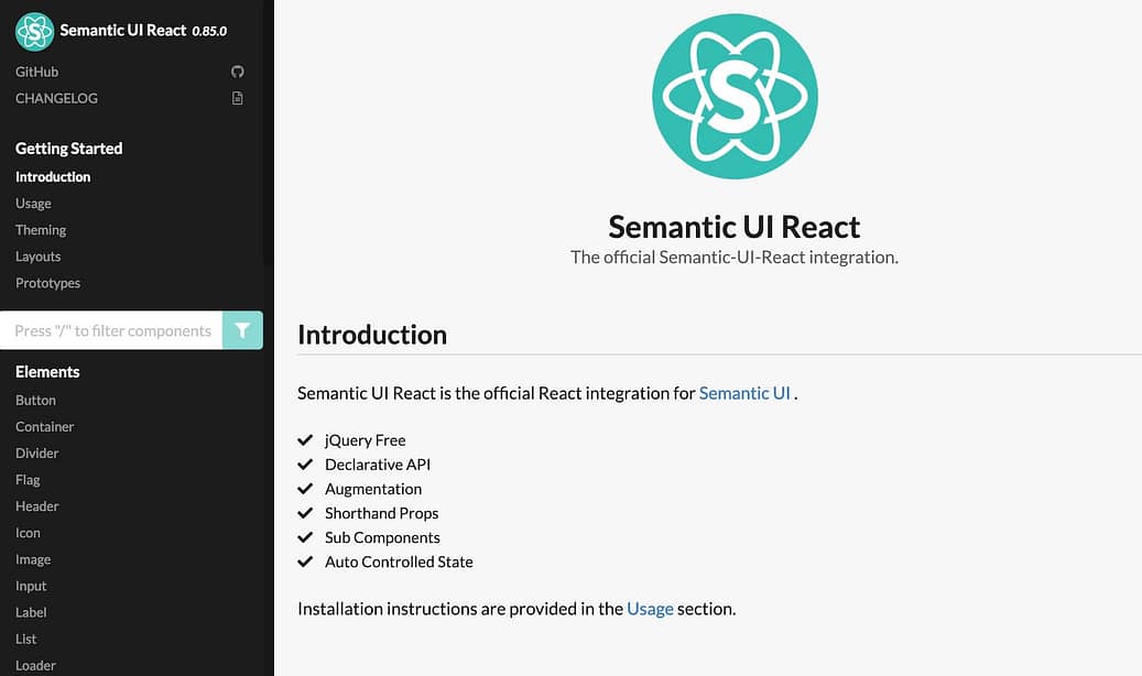
Semantic UI uses human-friendly HTML for it’s development framework, and has integrations with React, Angular, Meteor, Ember, and many other frameworks. All jQuery functionality has been re-implemented in React.
It allows you to load any Semantic UI CSS theme on top of your Semantic UI React app. What’s more, you’ll also have complete access to the markup, which means there’s flexibility in customizing components. It’s star count on GitHub is over 12,000.
Another React UI components library that you can use to implement Google’s Material Design principles in your project is React Toolbox. React Toolbox relies on CSS modules for this purpose. Though you can use any module bundler, it integrates neatly with webpack workflow. Thoughtfully, the team at React Toolbox provides visitors with an in-browser editor where you can experiment with the components in real-time.
While working with React Toolbox, you can choose to import components in bundles or raw components. The difference is, for the former, the components come with all necessary dependencies and themes injected for you. This means that the CSS for each dependency will be available in your final CSS automatically and raw components don’t include any CSS. This means you’ll have to provide a theme via properties to the component to be properly styled. React Toolbox has thousands of stars on GitHub.
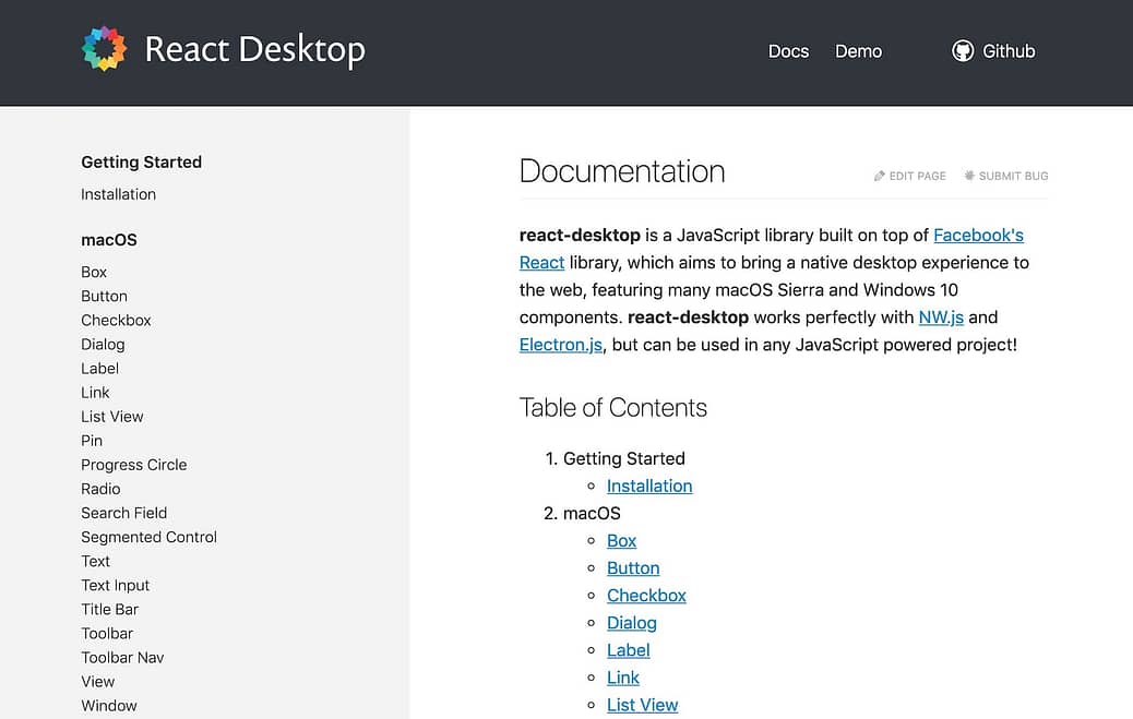
Our next components library, React Desktop uses macOS, Sierra, and Windows 10 components with the aim of bringing a native desktop experience to the web.
This collection is a JavaScript library built on top of Facebook’s React library and it’s compatible with any JavaScript based project. This tool crosses the 9,000 star rating on GitHub.
In case you’re into creating cross platform mobile apps, you’ll be interested in this offering on our list of React UI component libraries. Onsen UI is a mobile app development framework that uses HTML5 and JavaScript and provides integration with Angular, Vue.js, and React. All the components are auto-styled based on the platform, and so it supports both iOS and Android using the same source code.
Onsen UI is compatible with many popular React frameworks. An interactive tutorial helps you get a good start with this tool. The component library employs pure CSS with no JavaScript behavior. For some extra details, custom elements help out. The star count on GitHub exceeds 8,500.
Evergreen
Evergreen contains a set of React components that’s suitable for enterprise-grade web applications. Since it uses React Primitive, it’s highly flexible. At the same time, it works just as easily right out of the box.
It includes a wide range of components and tools starting from basic layouts, typography, colors and icons to function-based components such as dropdowns, toggles, file uploads, and feedback indicators. After installing the Evergreen package, you can pick and choose the components you want to import. It has thousands of stars on GitHub.
For simple React Bootstrap 4 components, check out Reactstrap. It comes with two primary distribution versions. One, a basic version that excludes optional dependencies. This gives you more flexibility in configuring required dependencies.
The second version is the full version that includes all the optional dependencies. This one is recommended for smaller applications. Reactstrap is yet another collection in the React UI components library that crosses the 10,000 star mark on GitHub.
Rebass
Rebass contains only eight foundational components, all in a super-small file. The components are extensible and themable, and built for responsive web design.
The components use styled-system and serve as a great starting point for extending into custom React UI components for your app. The ThemeProvider can also help you with this. The star count on GitHub is over 7,500. Note that this project hasn’t had any updates for a couple of years.
Grommet
Grommet has a wide library of components in its kit and counts big names like Netflix and Boeing among its users. Whether your app is for phones or for wider screens displays, you’ll be able to design layouts. Accessibility is via keyboard or screen reader.
Theming tools help with the customization for color, type and layout. This React UI components library has a star count exceeding 6,000 on GitHub.
Elemental UI
Elemental UI provides a number of basic functional components for standalone use or in any combination, whether in default style or after theming. Some of the components include forms, buttons, cards, and modals.
The project is under development, but manages a 4,000+ star count on GitHub.
React Suite
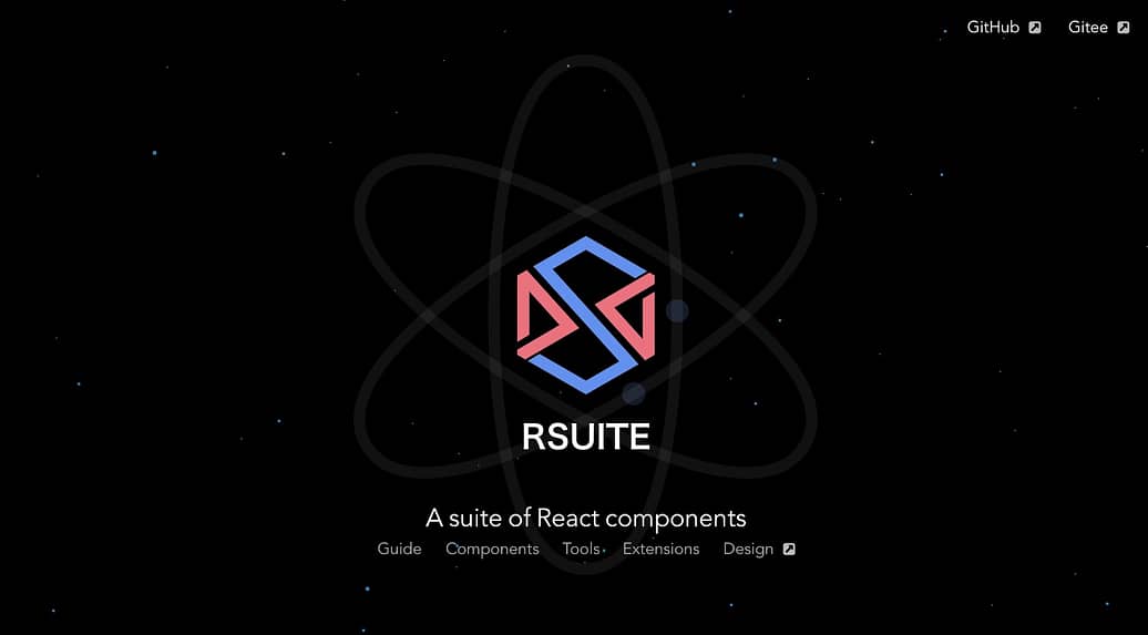
React Suite contains a range of component libraries for enterprise system products. It supports all major browsers and platforms as well as server-side rendering.
If you’re at home with Less.js development, customizing the components should not pose any problem. The components in this library include icons, loaders, dividers, tooltips and more. React Suite has more than its fair share of stars on GitHub and is regularly maintained.
Belle
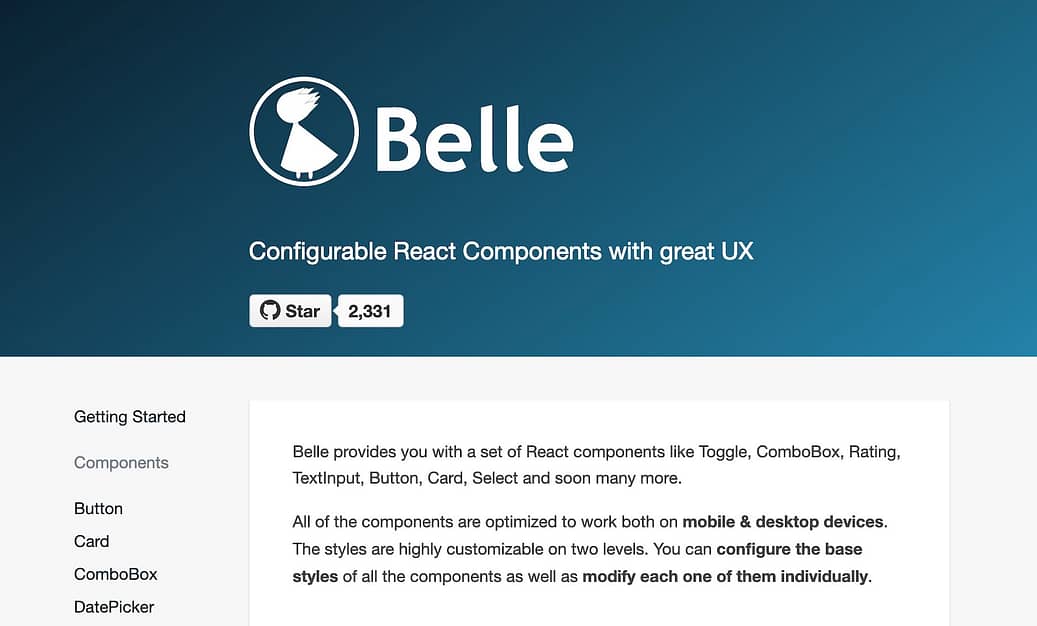
Among the most interesting React UI component libraries, Belle offers a truly wide range of components. You can customize these components at two levels – the base level for all components collectively, as well as each component individually.
The components are mobile-ready and include WAI-ARIA support. The way to go about using Belle is to first set up a simple app with React, and then import any Belle component and begin using it right away. This component library has thousands of stars on GitHub.
react-md
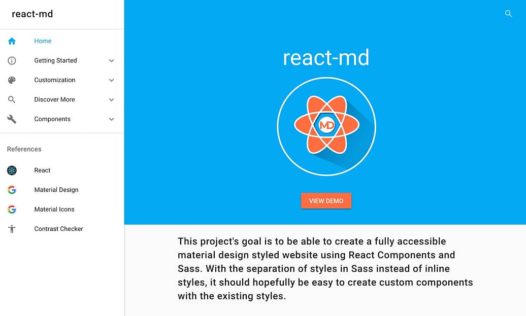
One more React UI components library that you should consider if you want to implement Material Design in your project is react-md. It gives you a choice of React components that work with Sass. For this purpose, there’s a separation of styles in Sass in lieu of inline styling. This makes it easier for you to customize components in line with existing styles.
Colors and typography can be customized and the detailed documentation will help you get past the basics. On GitHub, react-md has several thousand stars.
PrimeReact
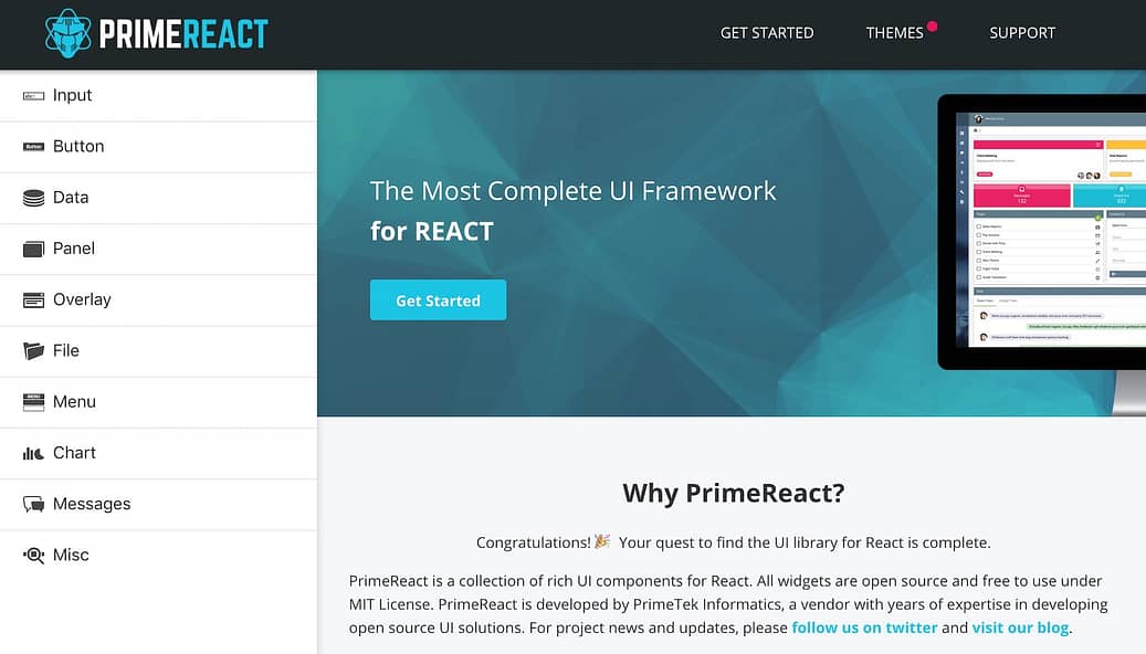
This list of React UI component libraries would not be complete without PrimeReact. It provides components to cover almost all basic interface requirements such as input options, menus, data presentation, messages, and more.
PrimeReact is mobile-friendly too, with touch-optimized responsive design elements. There are a number of templates and themes that allow you to customize and choose between flat and Material Design. This component library has several thousand stars on GitHub.
KendoReact
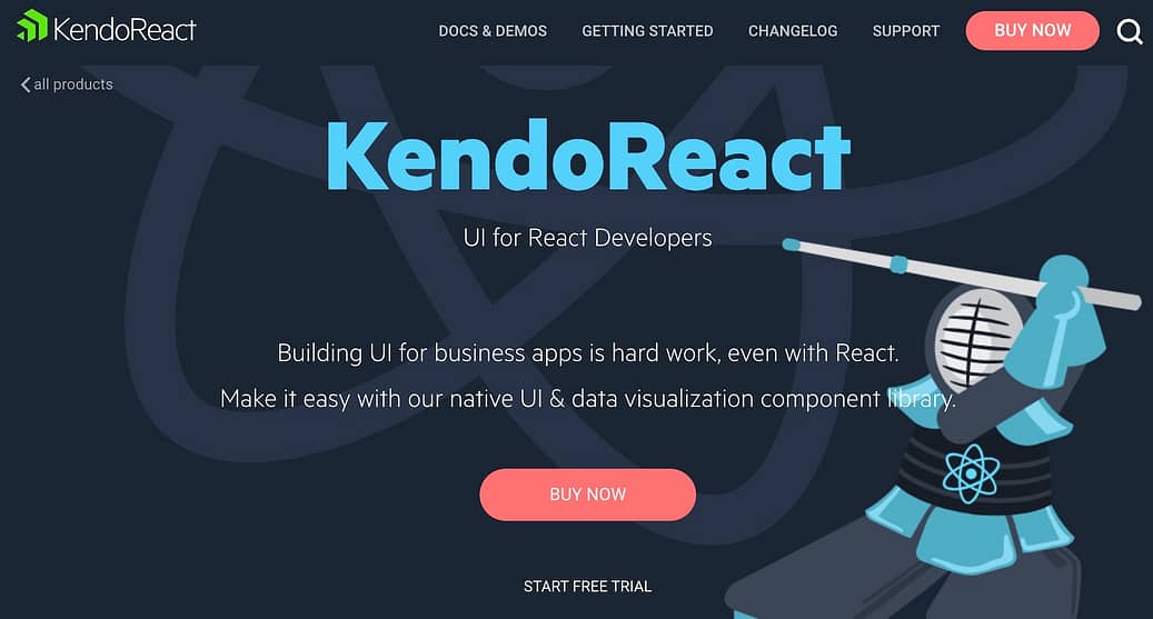
Unlike the foregoing React UI component libraries, KendoReact is a premium set of components, with licenses starting at $799. It boasts an impressive client list that includes Microsoft, NASA and Sony. And you too can use it to create fast and feature-rich apps with impressive UI.
The component set is specifically for React development. This ensures zero dependencies and all the components are fully optimized for React. Plus, if you’ve got an existing component library, you can simply add to it from KendoReact without having to rewrite the whole library.
Arco Design
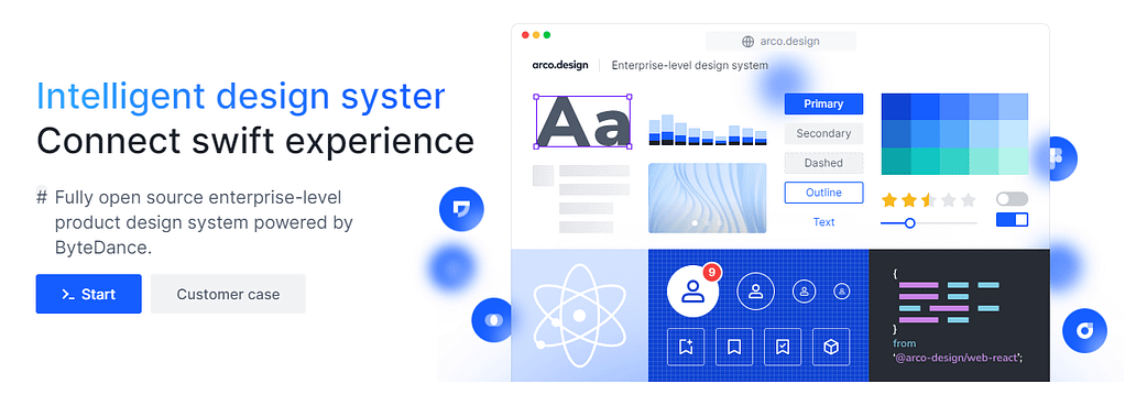
This is a comprehensive design system that includes assets for a number
of different platforms and technologies (e.g. Sketch, Figma) but also
includes a set of 60+ React UI components that are enterprise-ready and open source.
The components, written in TypeScript, include an extensive set of
design tokens so you can customize them to your own project’s
requirements.
The component set includes buttons, icons, dividers, lists, popovers, timelines, tooltips, datepicker, slider, and lots more. As mentioned, these are all part of a larger framework and design system that are under the Arco Design standards.
Well, that’s our list of the best React UI components libraries. Is your favorite library here?


No comments:
Post a Comment